LivingSocial FastBook: A Health & Beauty Pilot Project
Deliverables: Final responsive designs & specs | Status: Released | Role: UX Designer
Problem
Reduce tension and limit frustrations around booking health and beauty appointments.
context
There was an opportunity to bridge the gap and design an experience to help both customers and health and beauty users. Fastbook is the result of a small experiment at LivingSocial, allowing a team consisting of Development, design, project manager, legal and content strategy to berate and design a new experience. There was a significant opportunity to provide an experience around booking health and beauty appointments, and since LivingSocial ran a lot of health and beauty deals, it was an opportunity to integrate a booking platform, if successful into the experience.
our users
People who make health and beauty appointments or would like to make health and beauty appointments.
my role
My role included designing the core user experience, user testing, client interviews, marketing layouts and tactics, first time experience, and customer engagement while unifying them across one platform.
Process
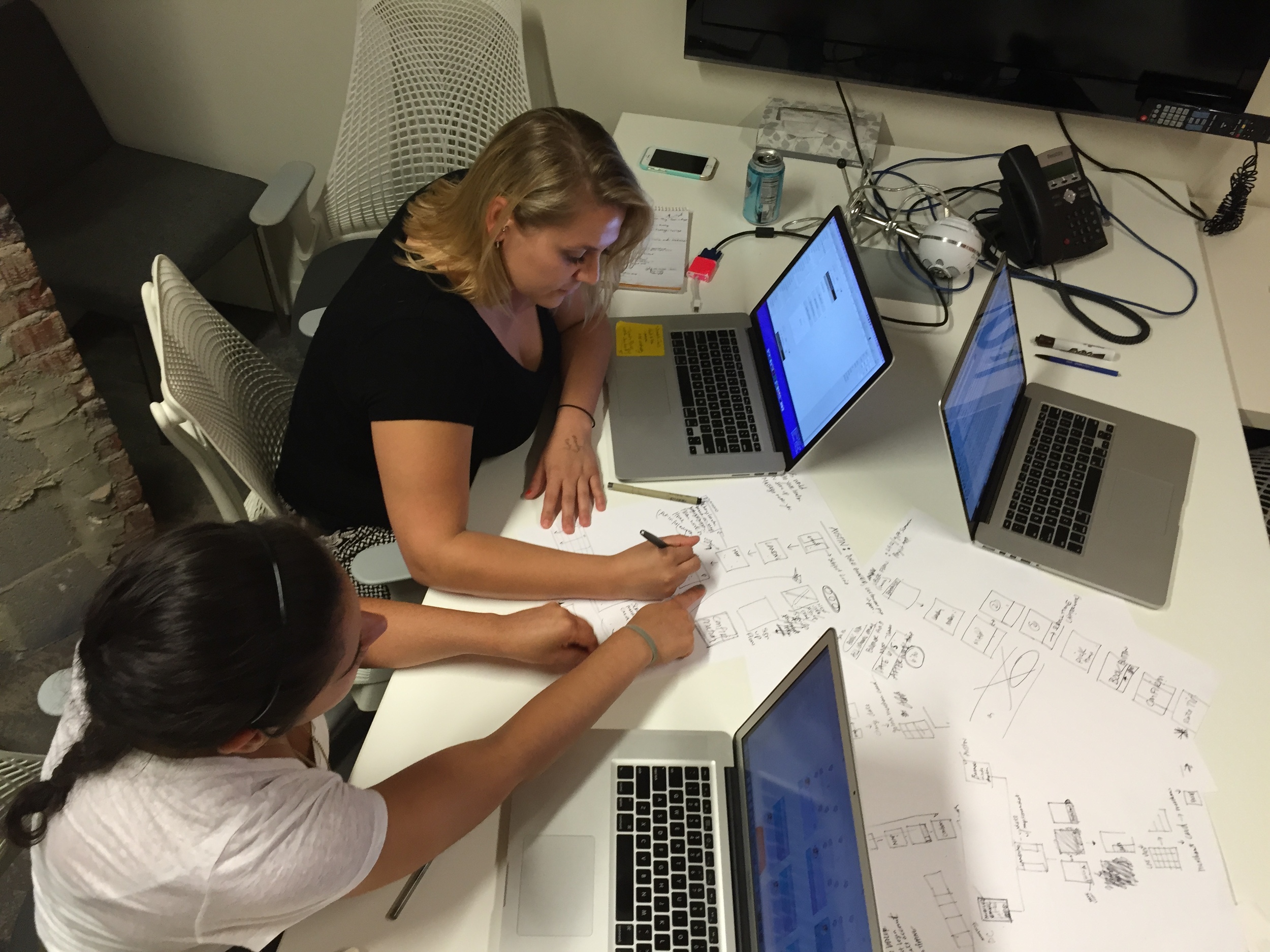
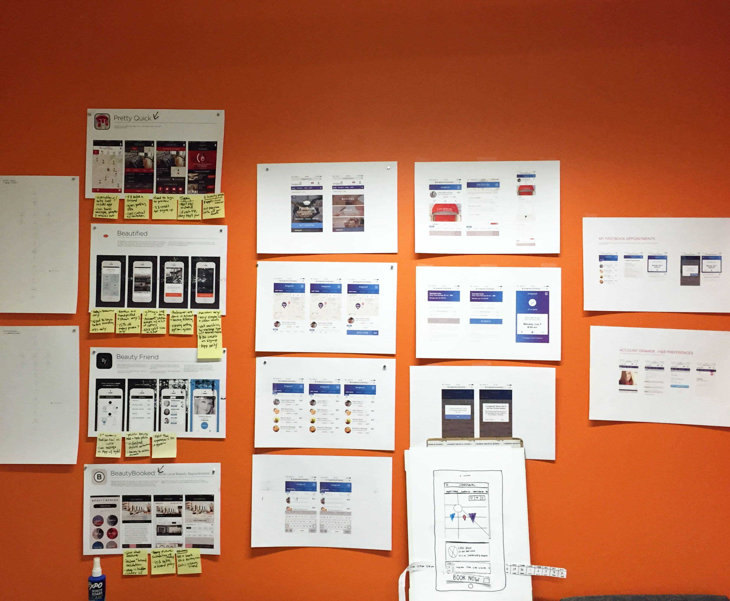
We started this project with numerous rounds of focus groups to gain a better understanding of the market today—what worked, what failed, and where could there be room for improvement. From there, we did many rounds of wire frame sketches, mock ups, user testing and prototyping.
Initial research learnings
Customer focus groups
Working with two other designers to organize and facilitate three focus groups, each one to two hours, of internal employees who schedule heath and beauty appointments. The key takeaways were that employees (1) felt a sense of uneasiness booking an appointment and receiving a confirmation online, (2) lacked familiarity with local offerings, (3) preferred availability in their immediate area (home, work, travel, etc.), (4) desired the ability to book last minute appointments, and (5) wanted to be able to make a full payment by card (w/ tip included).
Merchant interviews
Initially, we also wrote the script and conducted 8, 1-hour merchant interviews. The key takeaways were: (1) merchants felt an inability to attract new clients at an affordable price point as well as to elegantly showcase their services and skills, (2) merchants would also like the ability to optimize prices during peak and low volume periods, (3) they also felt an inability to collect information to encourage customers to come back due to a lack of staff, process, and (4) management of a loyalty program, and experienced lost revenue from cancellations was a big problem amongst merchants.
user flow
I mapped out the architecture of the product and worked closely with another designer and project manager to account for different use cases, and to find the optimal experience for our users.
user testing learnings - round 2
After exploring and designing the experience, I facilitated and ran user testing on eight potential customers, after exploring and designing the experience. The first key takeaway was that booking was too easy; every participant was surprised by how easy it was to book an appointment; however, because they wanted a confirmation step before booking, the experience felt “too simple.” The other takeaway was that there was no clear map or list-view winner. Some people preferred maps, while others preferred to browse lists, both of which are personal preferences we needed to keep in mind as we moved forward.
Core Functionality: BROwSE & BOOK AN APPOINTMENT
The primary purpose was to facilitate real-time booking with convenient times and locations in an effortless and seamless experience. Research demonstrates that users prefer either map view and list view (for no reason other than visual vs. contextual users) when browsing available appointments. After browsing and booking an appointment, users could now easily add the appointment details to their calendar, get directions from Google Maps , and even contact the merchant directly from the confirmation page.
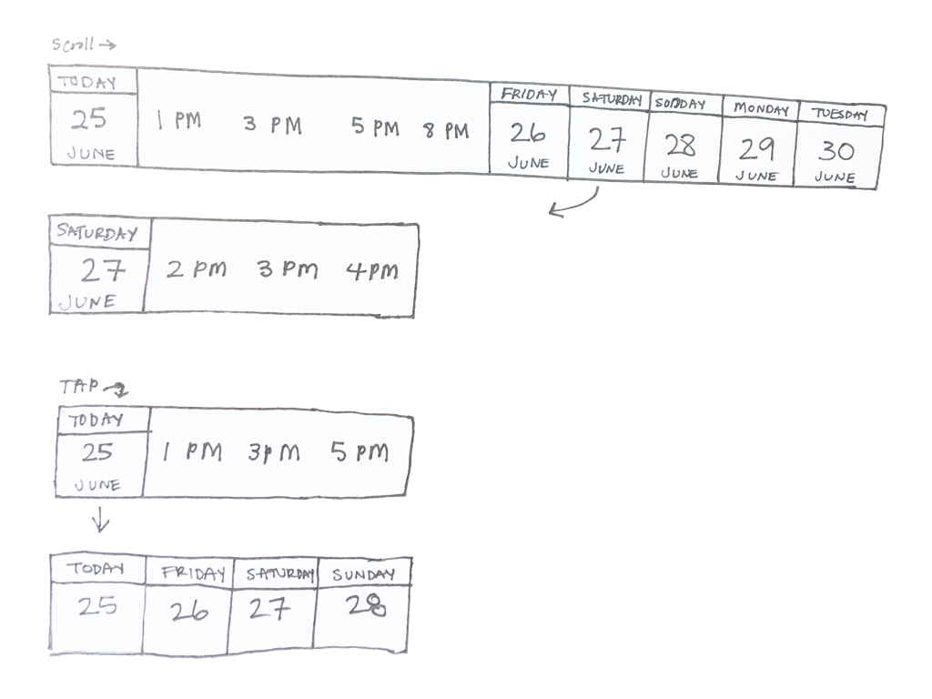
Feature breakdown - date picker
Navigating problems
How could users browse salons, locations, dates, and times all in one experience? We challenged ourselves to give users the best experience possible, which required iterating, exploring, and working closely with another designer to reach the right experience. The focus of Fastbook was in the here and now, helping users find the appointments they needed in real-time. However, we also thought it was important to support users that liked planning and booking appointments early, so we had to find the right balance.
Context & design
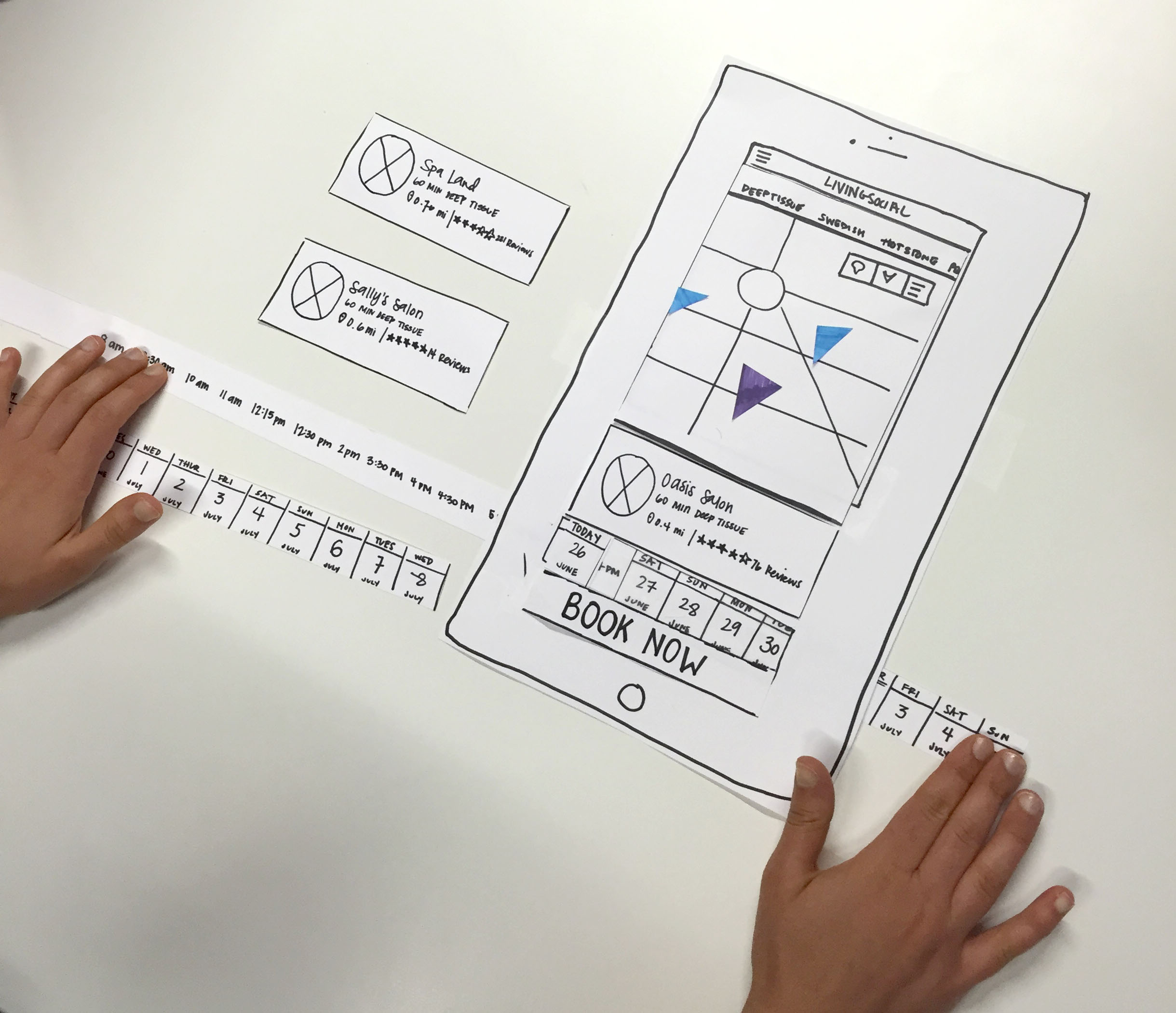
Wanting to allow users to browse while narrowing in on a date and time, I explored and iterated on a variety of solutions. Ultimately, the solution we landed on was a scrolling calendar, which allowed users to view the map or list view while narrowing in on a date or time. This experience not only reinforced the desire to book appointments in real-time but also allowed for planning and booking appointments early; clicking on the calendar icon allows users to pick a month and then dive into a date, resulting in a seamless and highly efficient experience.
Details & implementations
I worked closely with developers to implement this experience. Implementing the scroll functionality was difficult for one of our developers, so I worked with him and found a compromise to get the interaction done and out the door initially. I also pushed him to learn the implementation necessary to make this experience happen, mainly because no concerns were raised throughout the entire design and iteration process of this feature.
Responsive Design
Through responsive design, FastBook is easily accessible and consistent on mobile, tablet, and desktop web.
limitations & learnings
Timeline
Due to our rapid timeline, many compromises needed to be made with development to get this out the door on time. Compromises happen but being sure to have a clear expectation of delivery and follow-up steps was crucial.
Mobile web vs. app
Designing a mobile web page for this “app-like” experience was tough. Many of the animations and interactions we were hoping for were hard to implement or not possible in mobile web.
Initial test market
We launched a pilot of this mobile web experience in Chicago. Although we were able to sign on several merchants, we lacked an understanding of the city which made it too difficult to maintain from Washington D.C.


